
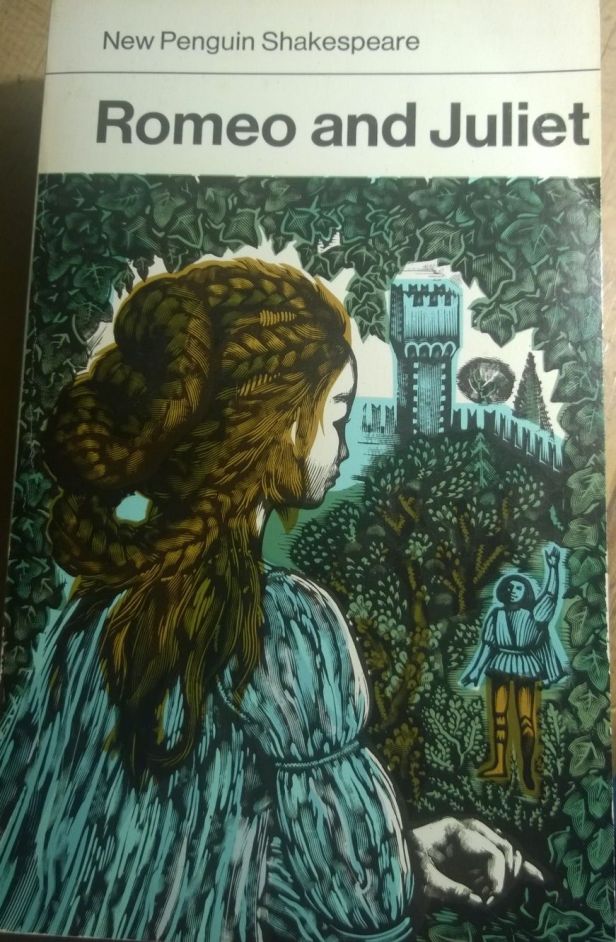
The distinguished artist and illustrator David Gentleman gave this year’s Kelmscott’s Lecture last month, and he used the occasion to look back at his own career for points of contact with William Morris. I thought I knew his work quite well (when I was a television producer I worked briefly with him on a short film based on his book A Special Relationship) but the range of the work he shared during the lecture was, frankly, stunning. Everything from a huge number of stamps to the Penguin New Shakespeare covers to Charing Cross Station to political posters to his more conventional illustrated books.
Listening to his talk, I think I discerned three themes that Morris would have recognised.
Access
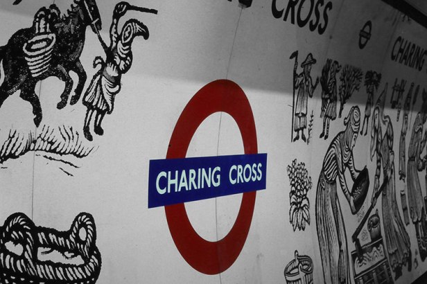
First, that good art and design should be accessible to everyone. It should be out in the streets rather than in galleries. Some of the stamp designs, for example, were classics of pocket expression. His Charing Cross Station murals, seen everyday by thousands of people who don’t have a clue who designed the panels on the Northern Line were the products of two years work. As he said, and several members of the audience confirmed, there’s a whole generation who associate Shakepeare with his striking covers.

Craft
Second, his careful interest in the craft of design. In part, this may be because of the more generalist visual education he enjoyed at the Royal College of Art in the 1950s, but ai suspect it is also a cast of mind. He spoke of his early love of Thomas Bewick’s wood engravings, and the difference between these and the woodcut. He showed some of his lithographs, and talked about the way that each colour needed its own plate. And he talked about the pleasure he got from being involved in the layout of his books, aligning images with text.
Radical
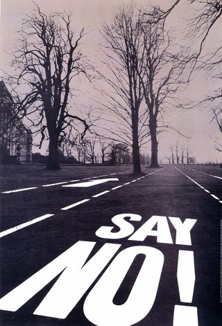
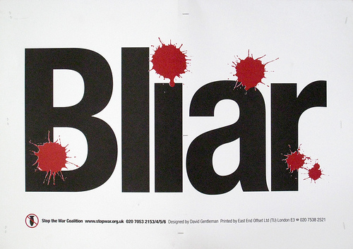
The third element is his quiet radicalism. He showed some posters he hsd designed for the campaign against driving a road through Petworth Park. A Special Relationship, published towards the end of the Cold War, is a scabrous look at the relationship between Britain and the United States. Gillray would have been proud of some of these illustrations. He has also contributed posters and images to the Stop The War movement, most notably the ‘Bliar’ poster, below.
But this same radicalism is also seen in other work. When researching the Charing Cross mural, and the royal mediaeval coffin procession that gave the station and the area its name, he looked into the work that women did (the dirty undesirable work of mixing the mortar, it turned out, which is represented in the mural.)
Similarly, my brother has a favourite image in Gentleman’s London book of a street person rummaging through a bin beside the regenerated retail complex that is the modern Covent Garden.
The Queen’s Head
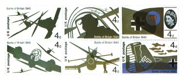
Gentleman told a couple of interesting stories about stamps, and specifically about the Queen’s head, which used to be depicted as a sort of locket portrait. When designing the Battle of Britain stamps, he concluded that they would look better without the head on them, so he asked Tony Benn, then the Postmaster-General, if the Palace would consider such a thing. Benn asked the Palace, and it turned out that they would not. But later they agreed to Gentleman’s suggestion that the head would work better on the stamps in profile, which lasts to this day.
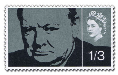
And in the starched protocol of the 1960s, the presence of the Queen’s head on the stamps caused other problems. The stamps issued to commemorate Churchill have that mysterious white line down them (see below) because the Queen couldn’t share the same visual space as a commoner. Really.
Dissent
I think there’s a fourth connection too, a contextual one. Morris’ work was done at a time when industrial manufacturing was booming in Victorian England. Much of it was of low quality, and the associated pollution was enormous, as a quick reading of News from Nowhere reminds us. David Gentleman grew into adulthood at a time when consumer culture spread rapidly, in Britain and Europe. Perhaps the environmental costs weren’t quite so high by then, but the cultural costs – such as the rapid spread of advertising into everyday life, which we now take completely for granted – were higher.
Similarly, the two men are connected by periods when the development of the built environment was driven mostly by speculation. In her Kelmscott Lecture in 2002 (“Morris, Hammersmith and Utopia”) Ruth Levitas wrote about how Morris’ Hammersmith was experiencing a huge wave of building development following the arrival of the tube network. As she writes, “Most of the major civic buildings and landmarks were built or rebuilt during this period.” She quotes a contemporary account by William Blake Richmond:
In 1870 … from my garden, looking over fields, old Hammersmith Church was visible. The mall, now utterly ruined, was lined with delightful old houses … We were not yet built round nor did hellish factories belch out the suffocating smoke which now lies like slime on our beautiful rivers. … Wretchedly-built streets cover what was once fertile meadowland.”
Similarly, David Gentleman has lived through a period in the 1960s and 1970s when speculative builders did their worst; developers destroyed far more of Georgian and Victorian London than bombing did. Although his city books are sometimes (wrongly) regarded as coffee-table books, they have a sharp eye for these tensions between the new city and the old.
Looking at the connections between the two men, both Morris and Gentleman chose to dissent from the world they saw around them, and turned to their craft and their art to try to make a difference to it.
There’s also a fine profile and interview at Eye Magazine.
