
There’s been a flurry of interest on the design blogs on the ‘FE-Mittelschrift’ typeface adopted for German number plates. It breaks pretty much all of the rules for typographic design, perhaps because it is designed to prevent manipulation of number plates. The most important ‘readers’ may be machines, not humans.
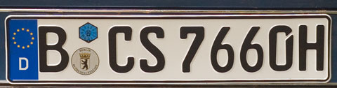
FE-Mittelschrift, which replaces the more geometric DIN typeface, is so called because it is hard to forge it by manipulating the letters and numbers (and there’s an entertaining online post by Suzanne Schaller, which demonstrates this). But unfortunately, as Eric Spiekermann points out on his blog,
Now every character is so unique that there is no formal relationship between them. Unfortunately this relationship is a condition for something we may consider a typeface. Without it we just see a collection of unrelated glyphs. While nobody could simply turn one of them into another one, now they all look totally forged in the first place.
The history is interesting; the idea of a ‘hard to forge’ typeface goes back to the days of the Red Army Fraction in the 1970s, when unscrupulous urban guerillas were confounding police by adapting their number plates. By the time the design was complete, the RAF members were locked up, and it took twenty years before the face was trialled in a couple of areas (in 1994). It’s only now being rolled out across Germany.
One of Spiekermann’s comments comes from someone who showed the typeface to a security expert, who suggested that it was primarily designed to be read by cameras – or more exactly automated number plate scanners – rather than people. Which raises an interesting question about design. Clearly there are already a number of design features which are there for machines rather than people (bar codes, for example). But these are usually tucked away. As we move into a world in which machines designed to observe and send information become increasingly ubiquitous, machine-readable design is going to be increasingly visible to us.
(Thanks to kottke.)
